Showing posts with label The xWHIP Challenge. Show all posts

HR/OFFB% Park Factors

The following comes from my latest post on The Hardball Times. Because of the width of our site, to get 4-year home run per FLYBALL park factors, you'll have to go to my above link to THT.

A couple of years ago, former THT writer Dan Turkenkopf tabulated an index of single-season (2009) and four-year home run per fly ball (HR/FB) park factors. I have griped plenty about using HR/FB rates over home run per outfield fly ball (HR/OFFB) rates in tabulating xFIP many times in the past, most recently last week, because HR/FB rates include pop-ups (IFFB), which can never be home runs. The data, over large samples, may be insignificant in difference overall, but why use bad data and skew the margins? It's like Fangraphs' incomprehensible decision to use strikeouts per at-bat (K/AB) instead of strikeouts per plate appearance (K/PA) to calculate strikeout percentage*. (Dave Cameron has indicated that recalibrating Fangraphs' database would likely be a cumbersome process.)

*Here are two examples why Fangraphs' K% calculations, done as K/AB, make no sense. First, assume player X has a particular K/PA in year N. In year N+1, he maintains the same K/PA rate, but increases his walk rate. Though his K/PA remains stable, Fangraphs would report his K% as having "increased," imparting negative stigma and poor analysis by persons who are not aware that K%, not on the same scale as BB% (calculated as BB/PA), does not per se indicate actual strikeout skill. Likewise, players with higher walk rates exhibit disproportionately high strikeout rates.

Ryan Howard, for example, has a career K% of 31.9 percent on Fangraphs, but has only struck out in 27.5 percent of his total plate appearances. For Howard, who strikes out a lot, this may not matter or make much of a difference if you analyze him, but for a player like Prince Fielder (career 22.1 percent K%), it does. Fielder has struck out in only 18.6 percent of his total plate appearances. On the surface, it would seem as though Brennan Boesch (20.4 percent K%) and Ryan Braun (20.5 percent K%) are "noticeably" better at avoiding strike three, but are in reality substantially the same, owning respective K/PA rates of 18.1 and 18.4 percent for their careers.

Other high walk "strikeout" sluggers, such as Geovany Soto, have K/PA rates that are lower than low-walk players with lower K% rates. Some say "well you can't strike out in a walk, so why use plate appearances in the denominator," but you also can't strike out in a hit or walk in a strikeout, and yet we accept plate appearances as the denominator for walk rate (BB%). Plus, just logically, shouldn't K% represent how likely a player is to strike out when he comes to the plate? Why make Shin-Shoo Choo's year-to-year K% like comparing apples to oranges because of a fluctuating walk rate?


Particularly where your data has an abnormal pop-up rate, HR/FB-tabulated xFIP loses a lot of its value. In fields like Oakland where there is a lot of foul territory, and in parks like Wrigley, where there is practically none, the differences in HR/FB and HR/OFFB rates might make a difference. The difference may be a couple of home runs at most (park factors only apply, in theory, in a half-step, as a player's expected number of home games is just 50 percent), but in a game of inches, such could affect Z-Scores, data distribution, etc. If memory served, HR/OFFB has also shown to be less volatile year-to-year than HR/FB.

Because I have such a penchant for HR/OFFB-based calculations, including them as a data point in my xWHIP Calculator, I asked a favor of Dan, who has in turn tabulated an index of HR/OFFB rates by ballpark using data from 2006-2009. We did not have the necessary 2010 data offhand to tabulate 2007-2010 rates, but hopefully this offseason we will be able to plug in 2008-2011 data for a fresher version of these numbers.

As with Dan's 2009 post on HR/FB park factors, certain parks have less data, are weighted similarly (but without the same old data to affect the weights), and may not be as reliable. The data below regards old Twins Stadium (the Metrodome), while the Mets' and the Yankees' Park Factors are from one season only. The Nationals' Park Factor also only uses two seasons worth of data, and is weighted at 5 and 3. All other parks feature four-year weighed factors of 5,3,2,1.

Without further ado, here is the goldmine of data you've probably always wanted, but never had (at least not that I was aware of) until now, ranked from most-to-least home run inflating per outfield fly:
Team              Park                         LG    4-Year HR/OFFB
Yankees New Yankee Stadium AL 120
Reds Great American Ballpark NL 116
Rays Tropicana Field AL 114
Orioles Oriole Park at Camden Yards AL 113
White Sox US Cellular Field AL 113
Rockies Coors Field NL 111
Astros Minute Maid Park NL 110
Brewers Miller Park NL 108
Marlins Dolphins Stadium NL 108
Blue Jays Rogers Centre AL 107
Cubs Wrigley Field NL 104
Mets Citi Field NL 104
Angels Angel Stadium AL 102
Diamondbacks Chase Field NL 100
Rangers The Ballpark at Arlington AL 98
Giants Pacific Bell Park NL 97
Red Sox Fenway Park AL 97
Tigers Comerica Park AL 96
Phillies Citizens Bank Park NL 93
Pirates PNC Park NL 93
Athletics McAfee Colisuem AL 92
Dodgers Dodger Stadium NL 92
Mariners Safeco Park AL 92
Braves Turner Field NL 91
Nationals Nationals Stadium NL 91
Twins Metrodome AL 88
Indians Jacobs Field AL 87
Royals Kaufman Stadium AL 86
Padres PETCO Park NL 79
Cardinals Busch Stadium NL 76


Thanks again to Dan Turkenkopf for crunching the numbers for me. As always, leave the love/hate in the comments below.

Making sense of xWHIP through the power of relativity

The following is my latest article for The Hardball Times.

Before reading this article, I encourage you to read my earlier xWHIP and eFIP; this is an extension of the data presented from it. All statistics are current through May 27.

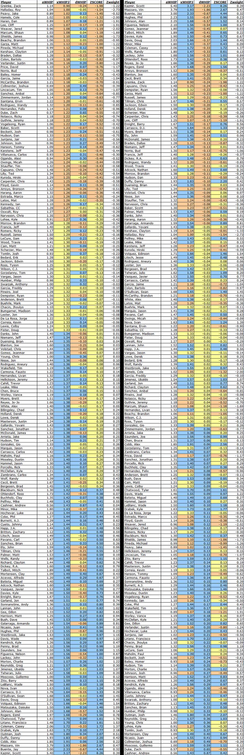
Earlier this week, I presented an updated form of my xWHIP Calculator, which, with the power of normalization, calculates a pitcher's expected hits and expected innings based on his batted ball profile. In raw form, I presented various data points for both xWHIP and eFIP. While useful, such absolutes can be hard to interpret. What does a 1.16 xWHIP mean in isolation? Particularly with the low variance in WHIP in baseball (the range tends to be largely between 1.10 and 1.50), small differences in WHIP can make a larger difference than you might think.

To address these problems, I have calculated each player's xWHIP Z-Score to give some sense of relativity. Because we are dealing with pitchers, where lower is better, I calculated the data so that the lowest Z-Scores equate the best impact players, while higher Z-Scores indicate the worst players with the biggest impact. I also tabulated a column of weighted Z-Scores scaled to expected innings pitched through May 27. This will give you some sense of which players should, in theory, have had the biggest impact on WHIP through the first two months of the season.

Because this column is weighted based on expected innings to date, which may vary in the future based on past playing time, it should not necessarily be consulted in evaluating a player's prospects (e.g., Zack Greinke has the highest Z-Score at -1.98, but only a -1.22 weighted score due to his limited number of relative starts to begin the season). For future value, you should consult the player's unweighted Z-Score, which should be scaled based on relative expected future innings. For example, if pitcher A is expected to pitch 20 percent more innings than the average full-time starter for the rest of the season, his Z-Score should be adjusted accordingly.

To make the data easier to interpret, particularly because I am using Z-Scores in lieu of an index (this was done because of pitcher clustering; the Z-Score calculations give a better sense of impact and relativity for xWHIP), I color-coordinated the data below.

Orange cells mean that the pitcher is in the upper echelon of the relevant column. For xWHIP, this means the pitcher has an xWHIP below 1.27. For dWHIP (the difference between actual WHIP and xWHIP), this means that the pitcher's xWHIP is at least 0.05 points lower than his actual WHIP to date. For Z-Scores, it means the pitcher has an xWHIP Z-Score of -0.35 or lower. These are likely pitchers to target for acquisition, particularly if one or more of his xWHIP, dWHIP, or Z-Score is colored orange.

Blue cells mean that the pitcher is in the lower tier of the relevant column. For xWHIP, this means the pitcher has an xWHIP of or above 1.34. For dWHIP, this means that the pitcher's xWHIP is at least 0.05 points higher than his actual WHIP to date. For Z-Scores, it means the pitcher has a Z-Score of +0.35 or above. These are likely pitchers to avoid or trade, particularly if one or more of his xWHIP, dWHIP, or Z-Score is colored blue.

Yellow cells are "neutral." These are players who are unlikely to have any significant impact on your team's future WHIP, for better or worse. The xWHIP threshold for neutrality is 1.27 to 1.33. I chose 1.27 as the lower end of the xWHIP threshold, despite the fact that the league average xWHIP is 1.33, because the sample of fantasy players in use is a subset of the starting pitching population. The worst pitchers in the league are unlikely to be on a fantasy roster, and at the same time are likely to post the highest WHIPs. In my preseason E.Y.E.S. post about how to calculate auction values, I tabulated the league average fantasy player's WHIP at 1.265. Because starters tend to have a higher WHIPs than relievers on average (expected mean starter WHIP was 1.30), I am using 1.27 as the lower bound of neutrality.

That all noted, here is a visually organized presentation of the data. The left set of data is organized by xWHIP, while the right set of data is organized by dWHIP (you'll need to click the image to enlarge it):


As always, leave the love/hate in the comments below.
Evaluating xWHIP 2.0 (and Quick xWHIP)

Editor's Note: The following article was written by xWHIP 2.0 Calculator co-collaborator and creator of Simple/Quick xWHIP, Martin Alex Hambrick. You can download the xWHIP 2.0 Calculator (requires Excel or Open Office) by clicking here.
About six months ago, I began tinkering with the concept of predicting WHIP. After all, WHIP is one of the most widely used indicators of pitcher skill, and in most fantasy leagues, it's a category. Additionally, the components should, in theory, be relatively easy to predict. Walk rate tends to remain consistent from year to year, and the number of hits a pitcher allow should regress, much like a pitcher's BABIP.

I set about predicting WHIP by regressing hits against various standards. While I was looking at the numbers, I noticed an interesting trend: WHIP correlated extremely strongly with K/BB ratio. I was interested in turning correlation into something useful for predicting WHIP, but I wasn't sure how to. So, I took the extremely scientific (sarcasm) path of using Excel to generate the trend line equation and then worked backwards from that.

I was left with the following equation: 1.54 - .512K = xH/IP . I rounded out the numbers, threw bases on balls into the mix, and was left with the following: 1.5 + (BB - .5K)/IP = xWHIP

This correlated extremely strongly with career WHIP, with an R-squared and R value of .6758 and .822 , respectively. However, it consistently estimated WHIP far higher than the actual results. So despite the strong correlation, the accuracy wasn't quite there. I tinkered with the variables involved and tried to standardize it based on factors such as league hits/out, and was left with the following formula, which worked well and was quite accurate. But I didn't have any explanation for why it worked. "It just works" was my motto:

1.375 + (BB - .5K)/IP = xWHIP

I sat on this formula for awhile until I met another stat-head, Jeff Gross, who had independently come up with the idea of xWHIP. However, he was using a far more scientific means of generating xWHIP, regressing against real game data averages for various events: ground balls, fly balls, pop-ups, line drives, etc. All of these tend to produce outs at a specific rate that remains constant from year to year. So if you have the number of batted ball types a pitcher allows, you should be able to predict the number of hits he will allow and thus predict his WHIP.

We worked together with the formula for expected hits, and came up with an additional statistic: expected outs, which would be used in place of innings pitched. While Jeff worked on further refining the formula, I reexamined the "Simple xWHIP" formula.

Using Jeff's formula, I plugged in the statistics of an "average" pitcher, one who throws an average number of ground balls, fly balls, line drives, and pop-ups. The only two variables I left unknown were strikeouts and walks. After simplifying the equation, I was left with the following: 1.3747 + (BB - .496*K)/IP. Since the goal is simplicity, and these numbers are close enough, we can round up and get exactly what I got before:

1.375 + (BB - .5K)/IP = xWHIP

Finally there was a valid basis for my formula that "just worked." After discovering that, I went to work at checking the statistical validity of both xWHIP (using the expected innings formula, not actual innings pitcher) and "Simple xWHIP." I did two calculations for each year: predictive and evaluative. Evaluative is simply comparing 2010 xWHIP vs. 2010 WHIP. Predictive is taking a pitcher's career xWHIP until a given year and using that to predict that year's WHIP.

The results were as follows:


As you can see, xWHIP does a pretty good job as both a predictive and evaluative stat. Stat-heads can look at the R^2 value. For the lay person, just look at "Accuracy." What that says is, if you picked a pitcher at random, his xWHIP would be, on average, that much higher or lower than his real WHIP.

As you can also see, xWHIP and "Simple xWHIP" are remarkably similar in their predictive and evaluative power. Full xWHIP is clearly the better choice when you have all the data in front of you, and it will more accurately reflect the abilities of extreme groundball and flyball pitchers. But, when it comes to simplicity, you can't beat Simple xWHIP. In many cases, you don't even need a calculator to figure it out.

So, using Simple xWHIP, let's examine pitchers in 2010. First, we'll look at the 10 pitchers whose xWHIP was significantly higher or significantly lower than their WHIP.


This gives a pretty good indication of people to steer clear of. Most of these are pretty obvious, but Matt Cain and Ubaldo Jiminez both strike me as pitchers a lot of people would overpay for.

On the flip side, some interesting names top the list of people poised for a bounce-back year. Of course, some of these you still want to avoid like the plague—a .13 dropoff from a 1.56 WHIP is still pretty bad. I'm looking at you, Paul Maholm.

Now, let's look at the people with the best WHIP, and what you can expect from them next year:


Cliff Lee, Jered Weaver, Roy Halladay, Mat Latos, Josh Johnson, Shaun Marcum and Justin Verlander are all poised to remain at or below a 1.2 WHIP, and you should pay face value for them. A few guys, like Adam Wainwright, Ted Lilly and Roy Oswalt should still be high-end WHIP pitchers, but be aware that they pitched far beyond their abilities last season.

Finally, let's take a look at the pitchers with the best xWHIP and see if we can find any high value pickups.


Most of the pitchers with very low xWHIP also had very low WHIP, so you will have a hard time getting them for a good value. James Shields, Scott Baker and Francisco Liriano seem to represent the best values here. Dan Haren and Tim Lincecum are good values in theory, but more than likely you will see people pick them up simply because they have the marquee name, so you may still have to overpay to grab them.

So there you have it. xWHIP and Simple xWHIP. Simple xWHIP, like FIP, is easy to calculate, yet still very powerful. xWHIP is a bit more complex, but accounts for much more and will give you a more accurate view of any specific pitcher, especially an extreme groundball or flyball pitcher.

xWHIP 2.0 Challenge #1: Matt Garza's 2011

Using the new and improved xWHIP 2.0 calculator, here is Matt Garza's expected WHIP for 2011 on the Cubs. Keep in mind he is not only changing parks, but leagues, so perhaps this figure is not as accurate as it could be (different park dimensions and locations affect batted ball distributions):